Thursday, 2 September 2010

Full Glass

I had a glass paint set as a gift and spent some time doing some glasses!! Some glasses turned out better than others but it makes them look so much more intersting. I made each one different.


Been away a while.... look what i found


Ok I'v been really busy lately so haven't really posted, however while I was away I got some good images, postcards from spain and some photo's I took. Below are some postcards I bought while in spain and have scanned in, I really love the one with pants and top on the line, I think it is unique compared to the others. All of them are quite different and these certain ones caught my eye.
Below are some photo's I took myself while away. the first too were actullay of me and my boyfriend at the harbour but both times my camera took twice and I LOVED the outcome thought they were sooooo cool!


The next two are of paintings we found on the wall while going through one of the towns, I have seen them before but these had loads of detail and looked really remarkable.
The last photo I thought was good beacuse I like the scenery and the way the bench kind of works with it.


Wednesday, 4 August 2010

Taster of what I like...

I love Alex Pardee's work!! I just think it's really unusual and some of his illustrations are really bizarre. I wouldn't say he inspires my work cause its not my kind of style but I still think what he does is great.


You can see more of his work and technique at http://www.eyesuckink.com/

Another illustrator is Sophie Robert, I just really like how they are quite simple butthe technique is quite nice...


Autumn Whitehurst has some amazing work. I really love her technique the pieces look so real.


You can see more of her work at www.art-dept.com/illustration/whitehurst


Monday, 2 August 2010

In The Office...

I have been working full time at Delta Labelling since my summer started. It is a labelling company and design labels and other types of sale points for clothes and the shops. I have worked here before and gave Ivan the designer a hand. He asked me to draw some stuff for him to put on labels. He told me what he wanted and below are a few of the drawings I did.


Some of the designs I did were used on labels for Heaven Sent and Ribbon.

I drew the cherubs, sheild and banner in the one and then the crown and banner in the other.


Wednesday, 21 July 2010

Lets get some Type!

So here are a few posts to show develoment and final pieces I have done in my typography work.


The first brief we were given was Good and Bad Type, we had to go out and take photo images of typography which we personally felt was good or bad, showing three of each. Below is just one example of what I thought was good then another I thought was bad....


Our second brief we had I felt was interesing and a different approach to how I have worked before. We were all given an A3 piece of plain paper which we then had to write our name on in whatever colour, style, font, size anywhere on the page. Then moving around the class adding words or letters to others paper. With the final piece we ended up with we then had to take parts of letters or shapes of letters in the piece and create our own word and type to suit the font. Here are a few images of my outcomes.

Creating my own Typography!

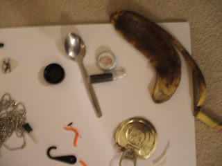
Another brief we were given was to find items! Anything you could get your hands on teh more random the better, like rubbish, something off the street, left over food, just to make it more interesting than taking stuff you own. I found some alright items, I think my best find was the sink plug and it still had a chain (in the bin), and my orange piece of plastic which i found on the floor in tesco!


Then with these pieces I created my own Type. I just experimented first with differnt words/sentences.....


I decided on the work link in the end as when looking at my found pieces most could be linked up to themselves in a way. Here is what I came up with.....


I do have more images of final ideas but I think these are the best out of them all. the two pieces I couldn't decide which to use as my final piece were the orange piece and the banana skin. In the end i chose the orange piece as this was made from the piece i found unlike in the banana skin where the word had been cut out of it.


Tuesday, 20 July 2010

Late start...

So im starting my blog... finally, it has been created for ages just haven't sat down to it. Throughout I shall be recording pieces I have designed in the first year of my course and also pieces I have done in my summer time. I am going to try and update this regulary so that I can keep track of what i'v been doing and so piers and friends can see.